


Mileage Charts
2020
Mileage chart study no.1: Ink drawing over a mileage chart of the UK (chart showing distances between cities in miles)
A quick exercise in simplifying and comparing different areas of tone.
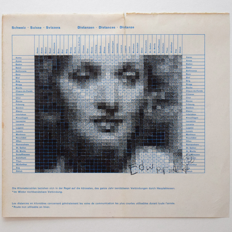
Mileage chart study no.2:
Ink drawing over a mileage chart showing distances in kilometres between Swiss towns and cities.
Original sold.


