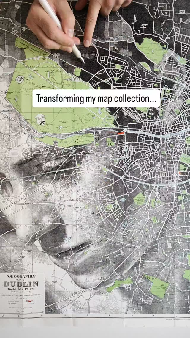

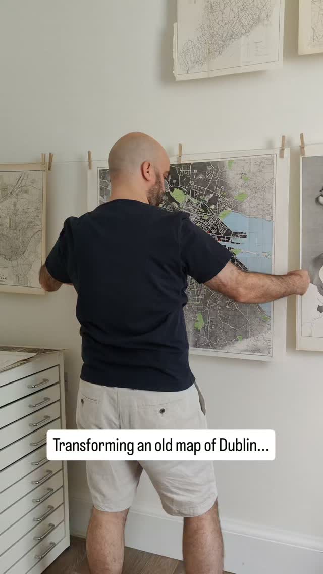


Dublin / Baile Átha Cliath 🇮🇪
Fountain pen and pigment liner on paper map, 28" X 28" approx.
5 days ago

I'm giving away a one-of-a-kind print of Oxford! The original map is without a compass, so I've taken a proof print and added one in ink in the upper right corner (shown at the end of this video)
If you'd like a chance to win this special hand-embellished print, you simply need to sign up to my newsletter - which of course is free - using the link at the top of my profile. If you're already on my mailing list, you don't need to do anything, you're already in the draw.
I'll be selecting a winner at random shortly after July 13th, when the draw closes. Thanks and good luck!
6 days ago


Zero7, the music I chose to accompany this reel... I used to listen to their music on the train home from college. Norwich to Diss, a 20 minute journey. It was such a relaxing 20 minutes and the day was always so long that I'd often fall asleep. Somehow I never missed my stop.
3 weeks ago

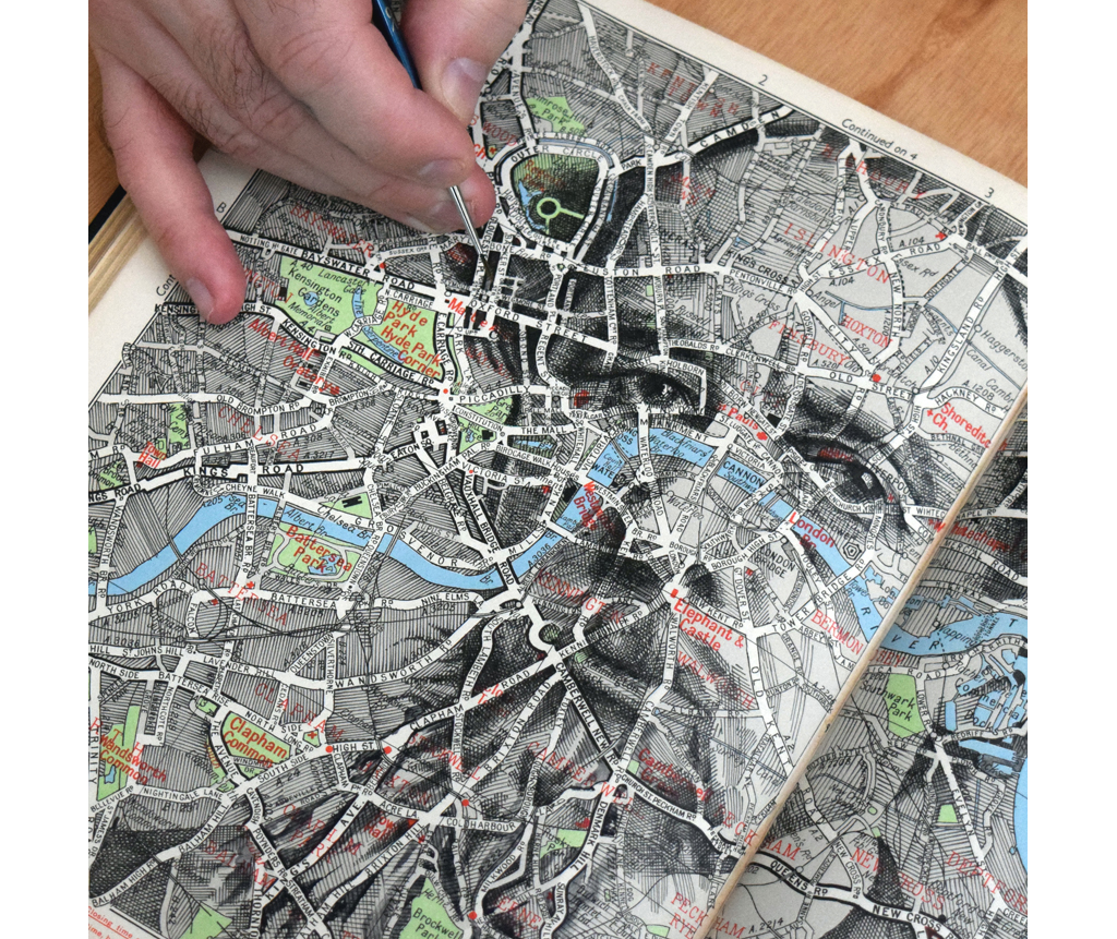
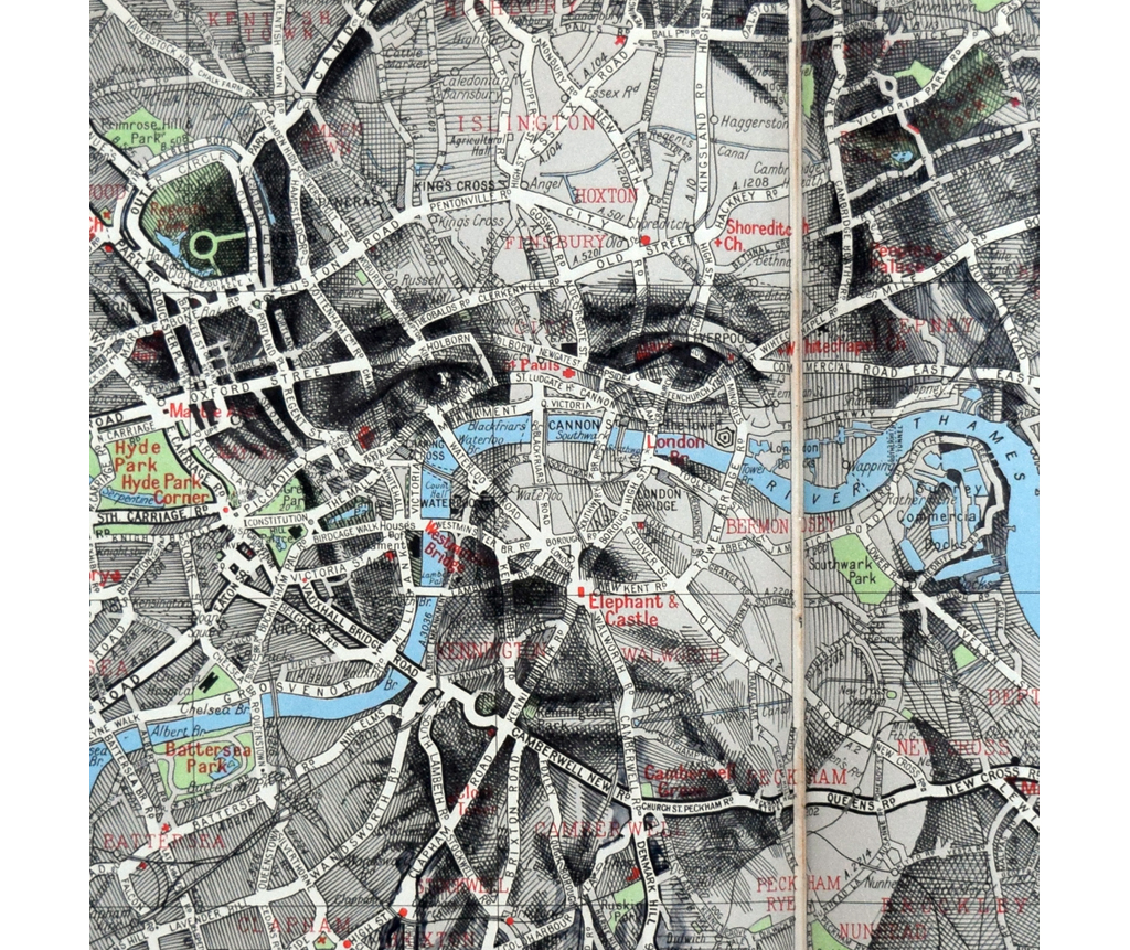
One of my most popular artworks according to the internet: a portrait drawn over an old map of Paris (ink on paper map, private commission, 2022)
Busy with commissions at the moment, wrapping up one or two things and wondering why it's basically winter in June
3 weeks ago


Around this time last year I spotted my portrait of Adrian Scarborough, commissioned by UKTV for U&Drama, on the TV in my living room.
Sitting down with a coffee and seeing my work by chance almost gave me a jumpscare, although I can't quite explain why. Of course I knew the portrait was being used as key art for the series; it was the whole point of the commission, and the exact usage had been discussed before any work had started - it was all in the brief - but there's just something about seeing anything I've made in the wild that gives a split-second feeling of "what's that doing there" followed by "hey, that's cool."
I'll be curious to know if other creatives ever have the same reaction?
4 weeks ago


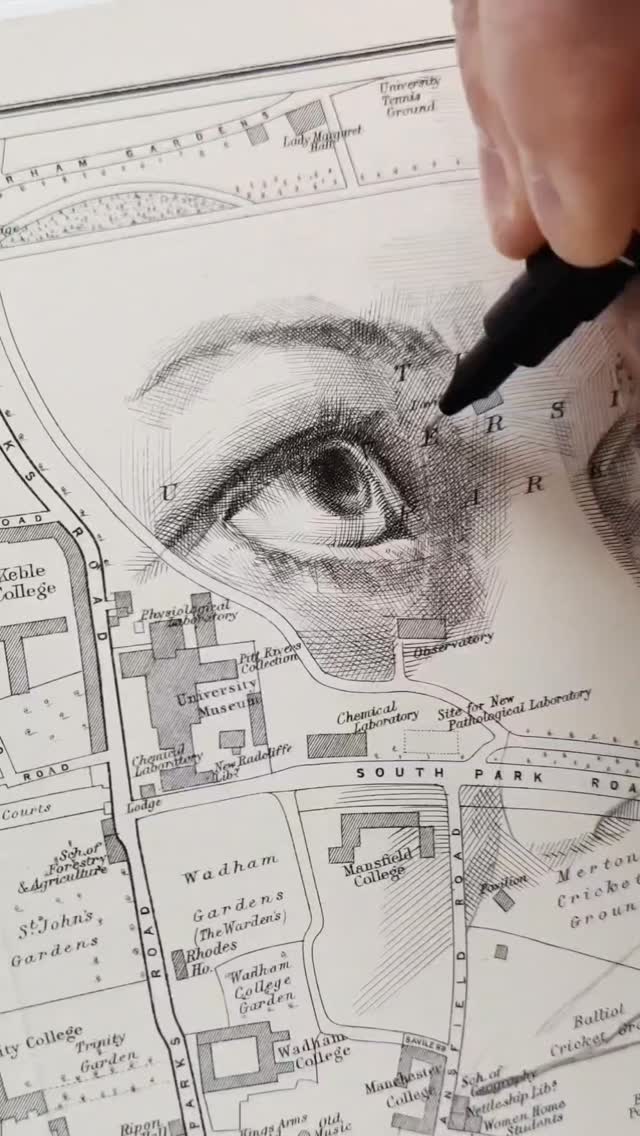
Crosshatching between the streets of Rome (2024)
If you've ever wondered why I press my index finger close to where I'm hatching, it's to stop the paper lifting up and down like a trampoline. If I were to draw on a brand new sheet of paper fresh from a pad, I probably wouldn't need to do this, but working with old maps means that the surfaces are rarely perfectly smooth and flat. No two paper types are ever the same, which is both a joy and a challenge.
1 month ago

Locations up and down the Thames, from Oxford to London ✍️
Apologies for the radio silence lately, I've been busy with commissions but I've also had a few things going on outside of the studio. Regular posting and new work will resume soon.
I hope you're all enjoying the weekend. If you're in the UK, remember that tomorrow is Sunday 2.0, and the weather's nice too 😎
1 month ago

Do you have a ritual when you start a new piece?
"I usually warm into a new drawing by working into less critical areas, or parts of the portrait which I know will be heavily toned at the end. It allows me to move my hand and get a feel for each particular map.
A relaxed, focused state of mind is important - and while I've found that the work itself feeds into that frame of mind, I often need something to set the tone at the very start, like a spark plug starting an engine or tinder lighting a campfire.
I've found listening to professional snooker matches puts me in an excellent headspace. I'm a huge fan of snooker; it's the only sport I enjoy watching. While I can't exactly watch it while working, I find the sound of the commentary to be calming, along with the cracking and potting of the balls, punctuated by a silence thick with the intense focus of each player"
A very warm thanks to everyone at @beautifulbizarremagazine for this in-depth interview, found in last month's issue 52
3 months ago


Inking the contours around the craters of the Moon (Chaplygin Crater, 2017)
This is a bit different to the crosshatching you usually see here, but still follows the same concept of turning maps into portraits.
I follow every contour line, changing the weight of each line to create a tonal range: thick, dense lines for shadows, light lines for highlights. See the last slide for a brief demo. I've not used this technique for a while, but with nothing new to share just yet I thought I'd post a little throwback.
This particular map is - quite literally - out of this world. It's an original NASA orthophotomap which I acquired from a map dealer some time around 2014, maybe 2015.
I sometimes use a brush for this technique, and every time I wonder, when does a drawing become a painting?
3 months ago


I visited my local gallery after lunch today, and was reminded of just how special it is to be able to see every detail of every painting up close, in the flesh.
These are close-ups of some of my favourite works from recent years (pinch + zoom for an even closer look)
There are plenty of imperfections... places where my pen has run a millimetre too far, or where I've used a scalpel to lighten an over-toned shadow. Imperfections can feel like major errors at the time, but in the end they're all just a part of the bigger picture.
4 months ago
From Plymouth to Edinburgh... crosshatching compilation, UK edition 🇬🇧
All ink drawings over old paper maps. Some of these are available as limited prints, although others are not as they've sold out! Whether you purchased a print yesterday or last year, I'll always be grateful. Thank you.
I've noticed lots of new followers here lately - and I think a lot of you are from the UK - welcome!
As always if you have any questions about my process, feel free to drop a comment below.
Have an excellent week 💙
4 months ago
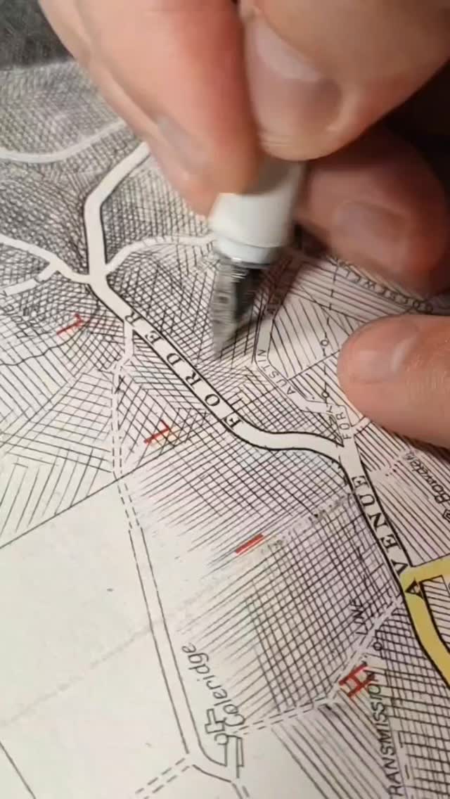
It's unusual for me to visit a place (on paper) more than once but it does happen!
These two drawings were both crosshatched over folding maps of Oxford, UK. One place, two different outcomes. I'm sharing both again today while I press on with some new locations.
If you have any questions about my process or suggestions of places I should cover, feel free to comment below!
4 months ago

Crosshatching between the streets of Paris (private commission, 2022) 🗺️✍️
4 months ago


Items I've mailed: A Rubik's Cube
In 2011 I wrote a delivery address across several sides of an unscrambled Rubik's Cube. I then jumbled the cube, placed it inside a clear plastic bag labelled "solve me" before dropping it into a mailbox. The idea was that the postal service would need to solve the cube in order to deliver it.
Which surprisingly, they did.
It was received just a couple of days later. Royal Mail didn't solve the cube completely, but they did narrow down the address to two possibilities; the recipient's address being one of them. When it was delivered, the bag was covered in trial and error - possible postcodes noted and crossed out, new postcodes written underneath - and eventually a road name and two possible house numbers.
This was a standout experiment from my time as an art student (2008-2012). It was part of a wider project which involved mailing various 'naked' items, puzzles and artworks, using the postal system as a sort of forced gallery space. It was some of my earliest work around the themes of creative intervention, 'off-road' drawing, and using unusual surfaces or contexts as a channel or canvas for my artwork. Along with other similar experiments at the time, it helped sow the seeds of what I do now, turning old maps into detailed portraits.
4 months ago


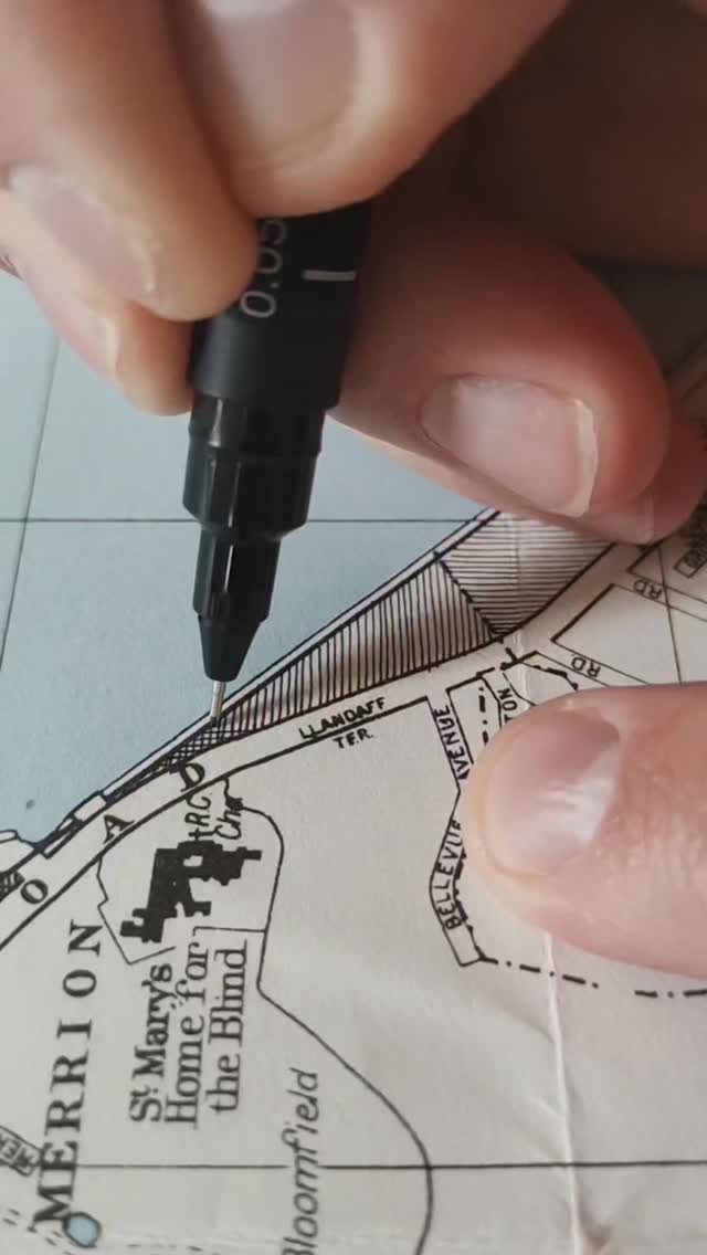
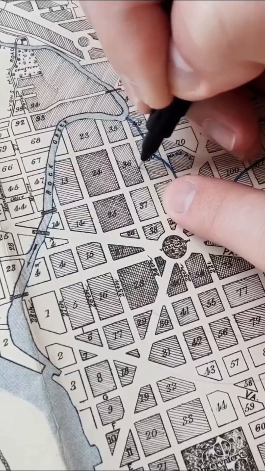
Transforming old paper maps into portraits, one line at a time 🗺️✍️
4 months ago

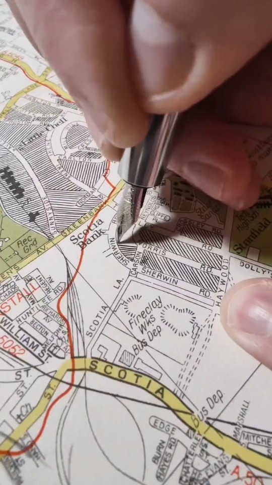
Transforming old paper maps into portraits, one line at a time 🗺️✍️
4 months ago

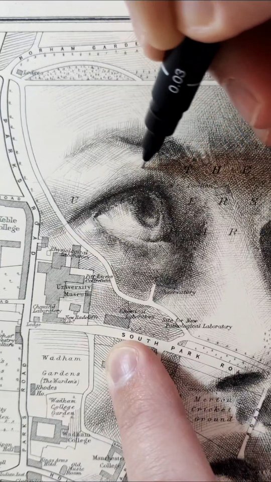
Transforming old paper maps into portraits, one line at a time 🗺️✍️
Audio is from my appearance on BBC Radio Solent, where I was invited on to chat about my portrait work for Universal Music and the John Lennon Estate
4 months ago
Transforming old paper maps into portraits, one line at a time 🗺️✍️
Audio is from my appearance on BBC Radio Solent, where I was invited on to chat about my portrait work for Universal Music and the John Lennon Estate
4 months ago


For anyone new here... my work and drawing process in a nutshell 🗺️✍️
4 months ago